
Research and Discovery, User Interface and Interaction Design, Testing and Iteration.
"Pingdom is a trusted provider of easy-to-use and powerful web performance and digital experience monitoring — giving actionable insights into web application's health and performance, helping businesses deliver great digial user experiences."
In other words, Pingdom is a tool that can help make sure that your website or application is available from all over the world, that all your critical pages are loading quickly, and that all your vital site interactions, like signup, login, and checkout flows are working correctly. When something breaks, it immediately lets you and your team know and gives you the information you need to get to the root of the problem and resolve the issue.
Every time a website or application is down or running slow, there is direct impact on the business, either in reduced productivity or lost customers, and, as a result, lost revenue. But it is not just about the availability. It is about the performance and resulting end user’s experience. Customers need to be able to monitor user interactions and critical business transactions and get actionable insights to be able to fix issues before the end user feels the impact.
Our task was to build a product that solved some of the most complex website performance and reliability issues, make it easy to use, and do it at an affordable price.
At Pingdom I was Senior UX Designer and Team Lead, working on research and discovery, user interface and interaction design, testing and iteration. My team was part of a larger, distributed international team, and I collaborated with product managers, researchers, designers and developers in Västerås, Kraków, Brno, Portland and Austin on building products for a global audience.
I worked on concepts and designs of a number of analytics dashboards, alerting capabilities, a single-sign-on experience and product onboarding. I performed discovery and ideation activities, conducted user research and usability testing, wireframing, prototyping and created high-fidelity designs.
Below you will find a small sample of designs from various projects that I was involved in during my time at Pingdom.
We knew people use Pingdom to feel safe that their websites or applications are working as intended and to be notified if something breaks so that they can fix it. We wanted to create a solution that help people get their monitoring set up as quickly and easily as possible and make them feel that they can trust the system. We also knew that some of our customers were not using all the different features that was included in their subscription — and were not getting the full value of what they had paid for — so it was important they understand the value proposition quickly.
We created a simple onboarding flow where people can learn about the benefits of the different features and can set up their first monitoring and alerting in just a few clicks. They receive immediate feedback that their site is being monitored and an email or text message is sent which confirms that their alerting working properly.
The onboarding only appears the first time people go through the flow but does not prevent them from continuing through the flow.
Monitoring a website or application can happen in two ways. Either via Synthetic Monitoring, i.e. scripted tests running on a schedule, simulating an action or path someone would take on a site, or via Real User Monitoring i.e. collection of data or recordings of visits from real people on a site.
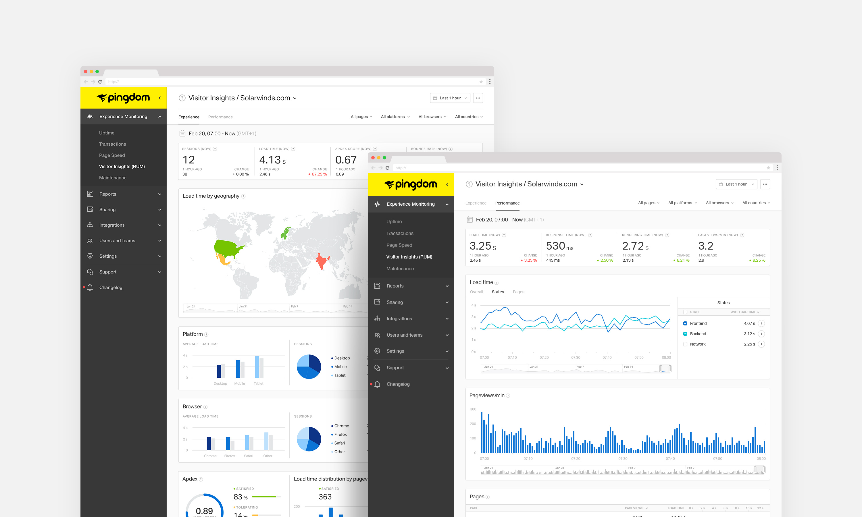
We worked on a number of analytics dashboards and reporting tools that allow people to know exactly how their site or application is performing and what the experience is like for end-users.
Data on the Real User Monitoring dashboards can be filtered allowing people to get a better understanding of how visitors from different parts of the world, on different platforms, browsers and devices are experiencing a site at different times.

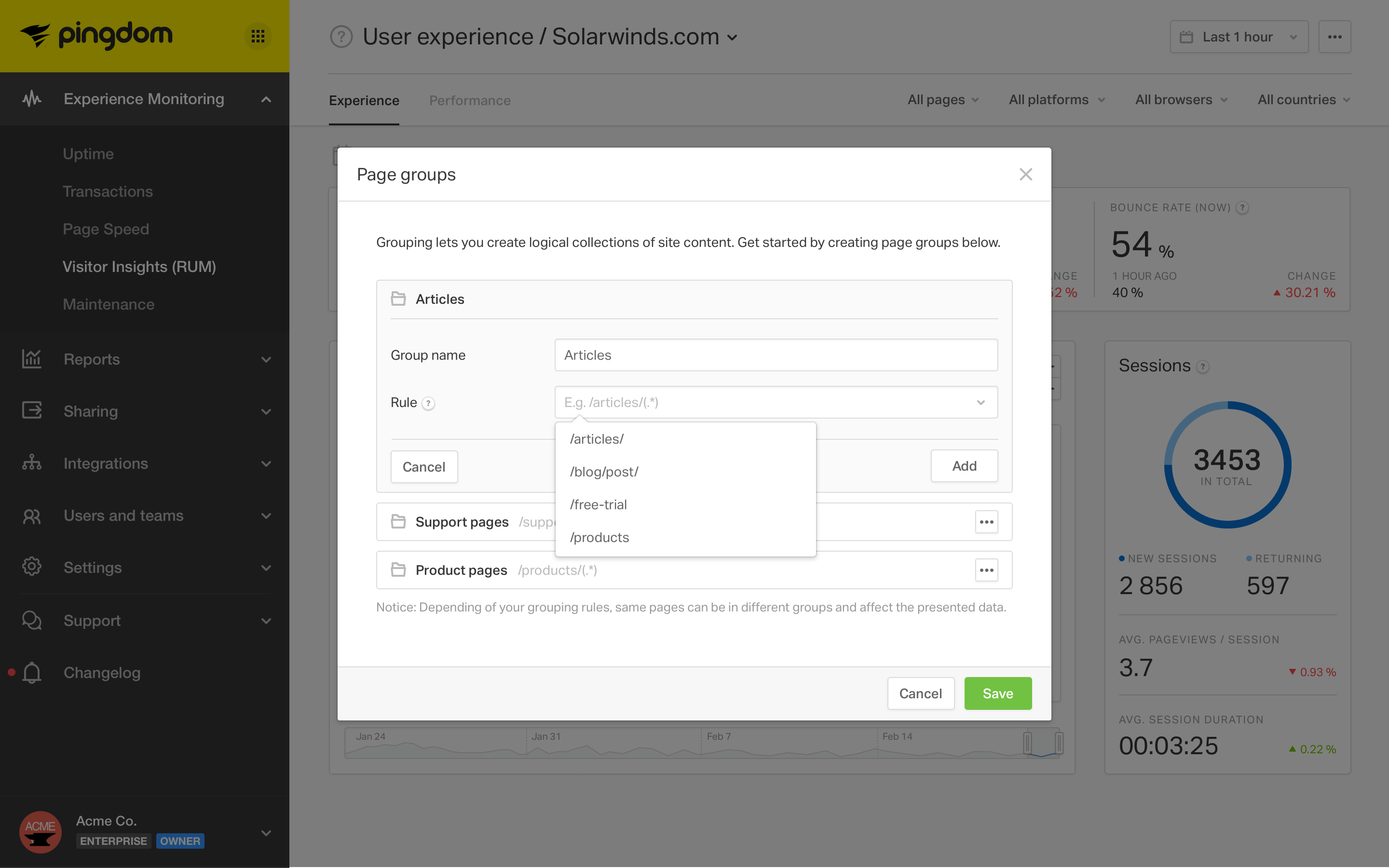
Pages (URLs) can be grouped and used as filters, making it easy to see how certain sections of a site or application is performing.
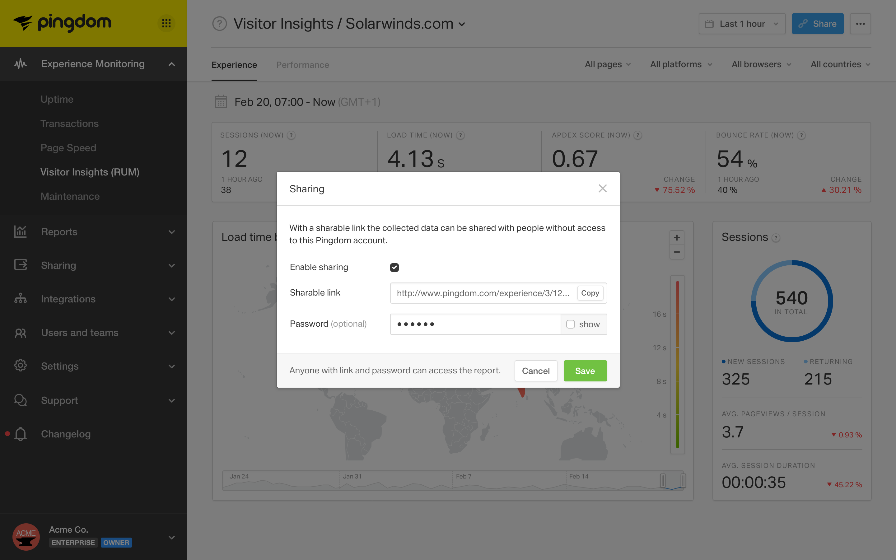
Shareable online reports allow people to share data with customers and stakeholders without compromising the security of their account.
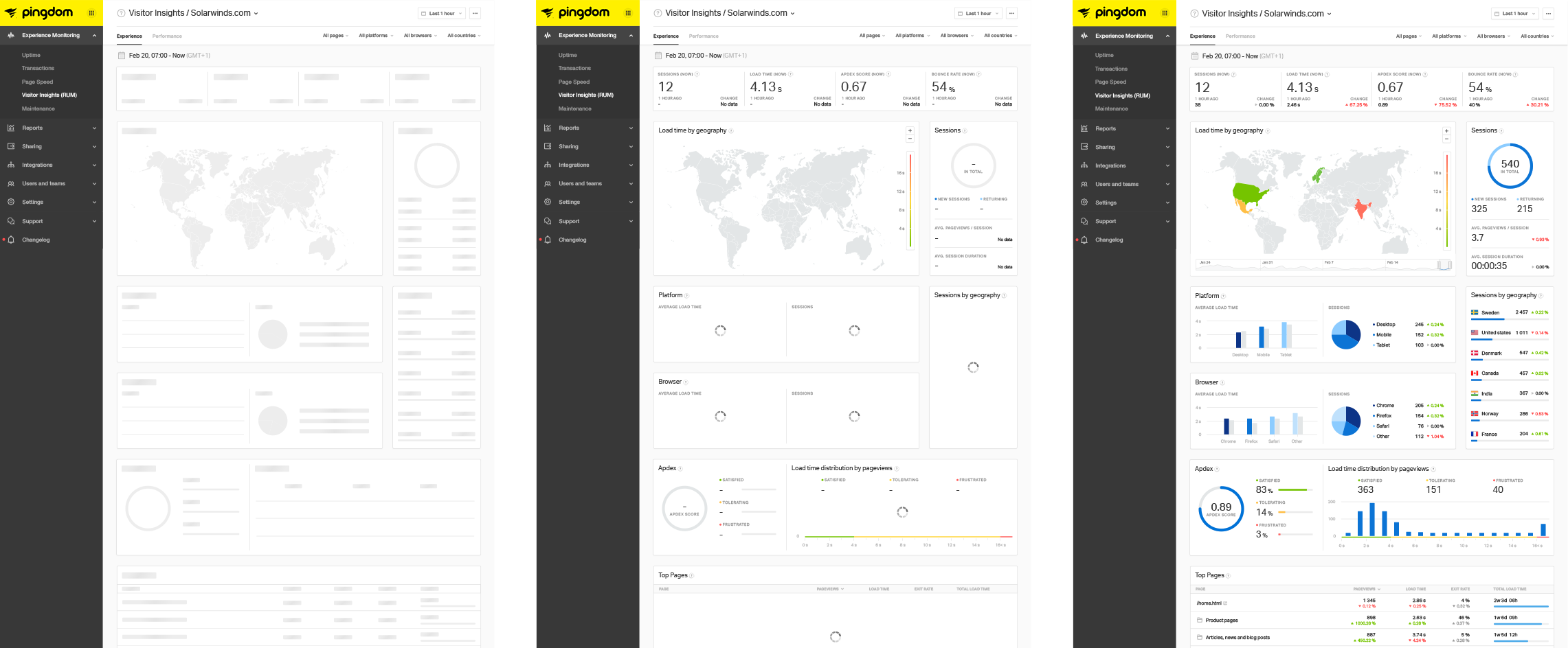
Information on the analytics dashboards are loaded gradually, a little at the time. Loading large data sets can sometimes take several seconds, but we did not want people to have to sit impatiently waiting for pages to load while staring at a spinner. To give a sense of progress and to set the right expectations, the basic elements of a page are loaded first, then as the rest of the content is loaded, it is populated on the screen.
Being a subscription-based business model, Pingdom offers a number of different plans, suited for small businesses to large enterprises. We created a solution that makes it easy for people to manage their subscription, explore new services and stay in control of the spending.
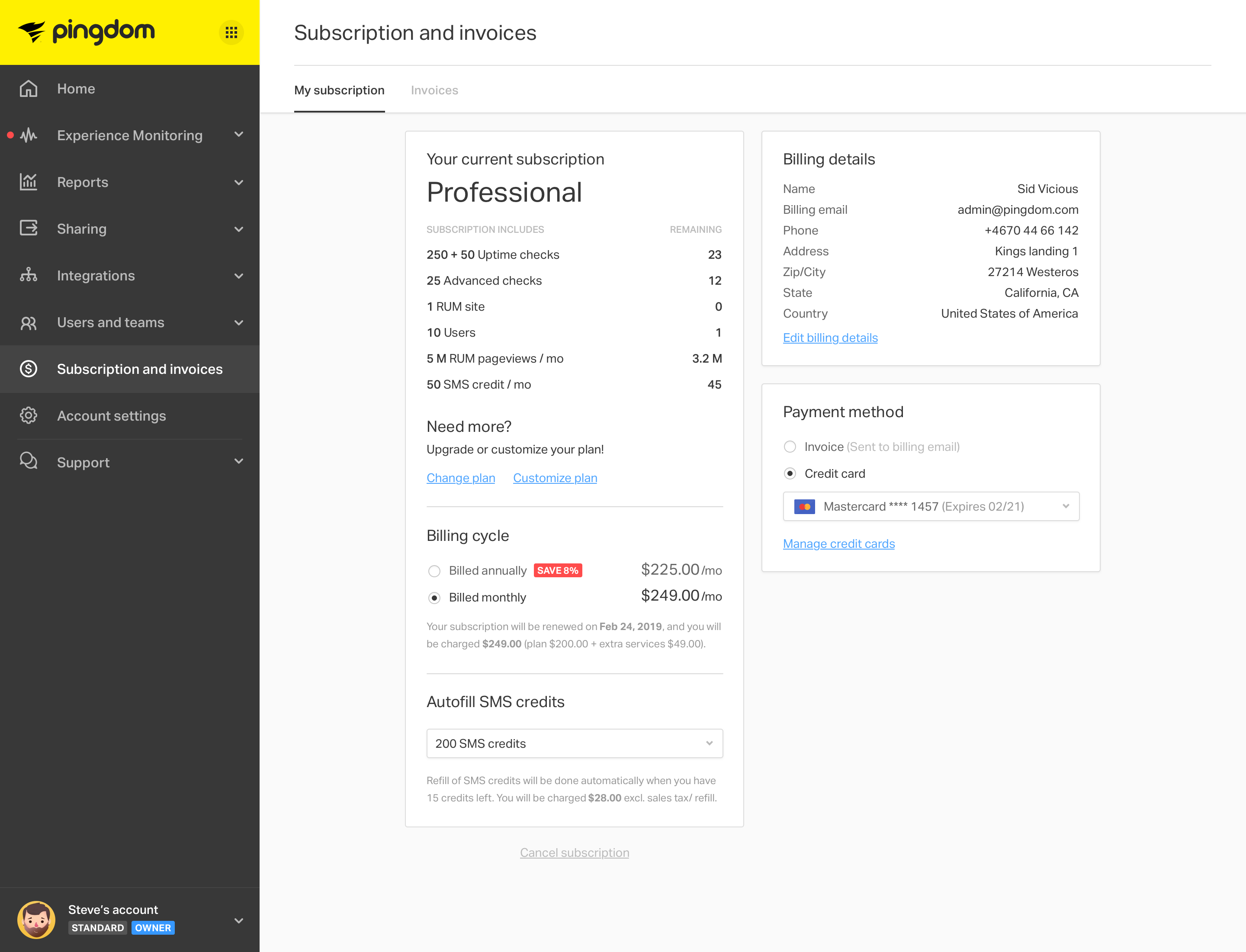
On top of the various plans, people can customize their subscription to match their budget or monitoring needs by changing the number of checks, users and pageviews they want to have included in their monthly or yearly plans.
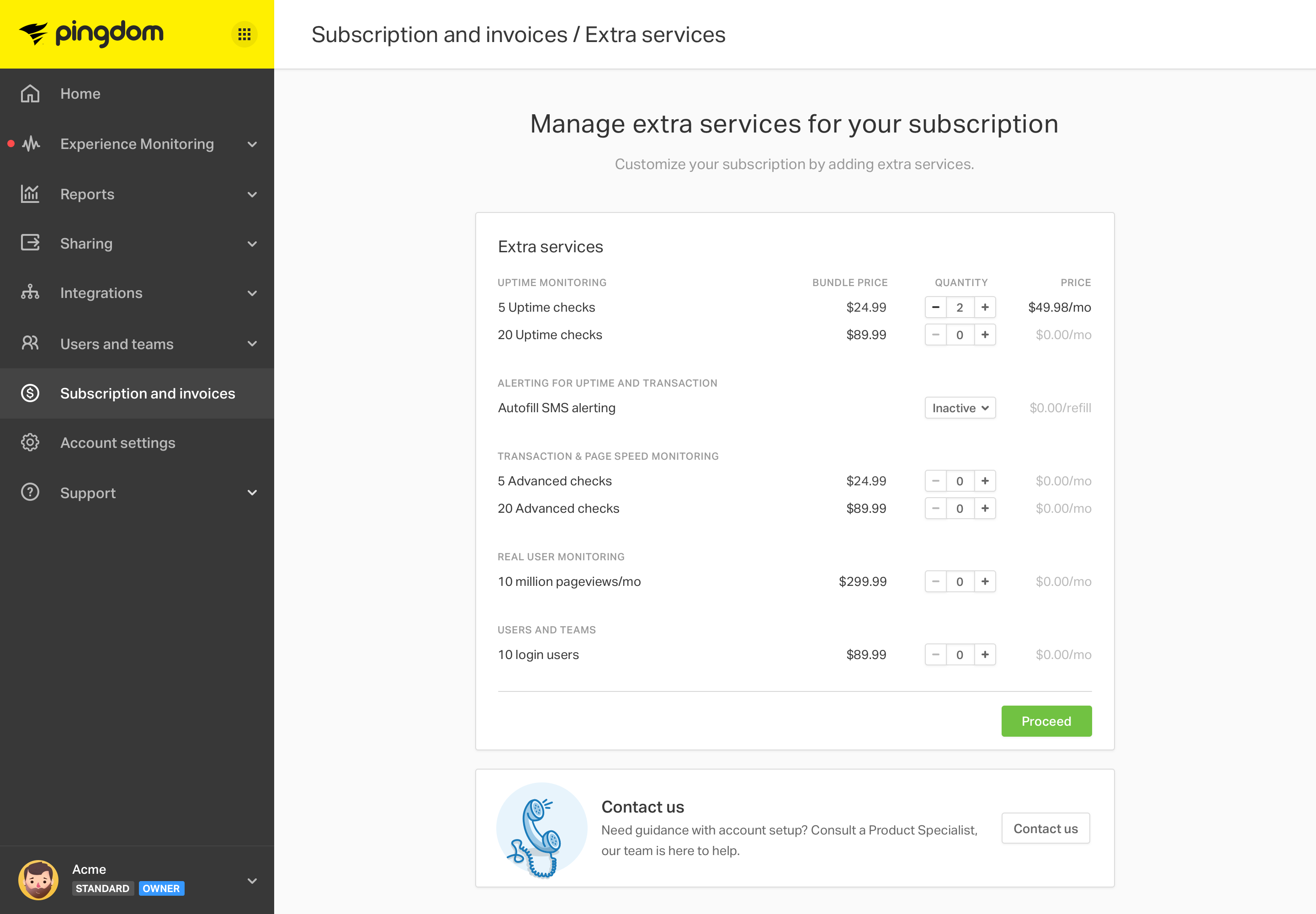
There are a number of features that are only included in the higher plans. We wanted to be able to upsell these featuers without interrupting the regular workflows. When a feature is not included in the current plan, a lock is displayed on certain elements in the interface. These locks indicate that the feature is not currently available. People can interact with these locked elements to learn more about the feature and have the possibility to upgrade. Smart and well timed "toast" notifications are also used to make people aware of these features.
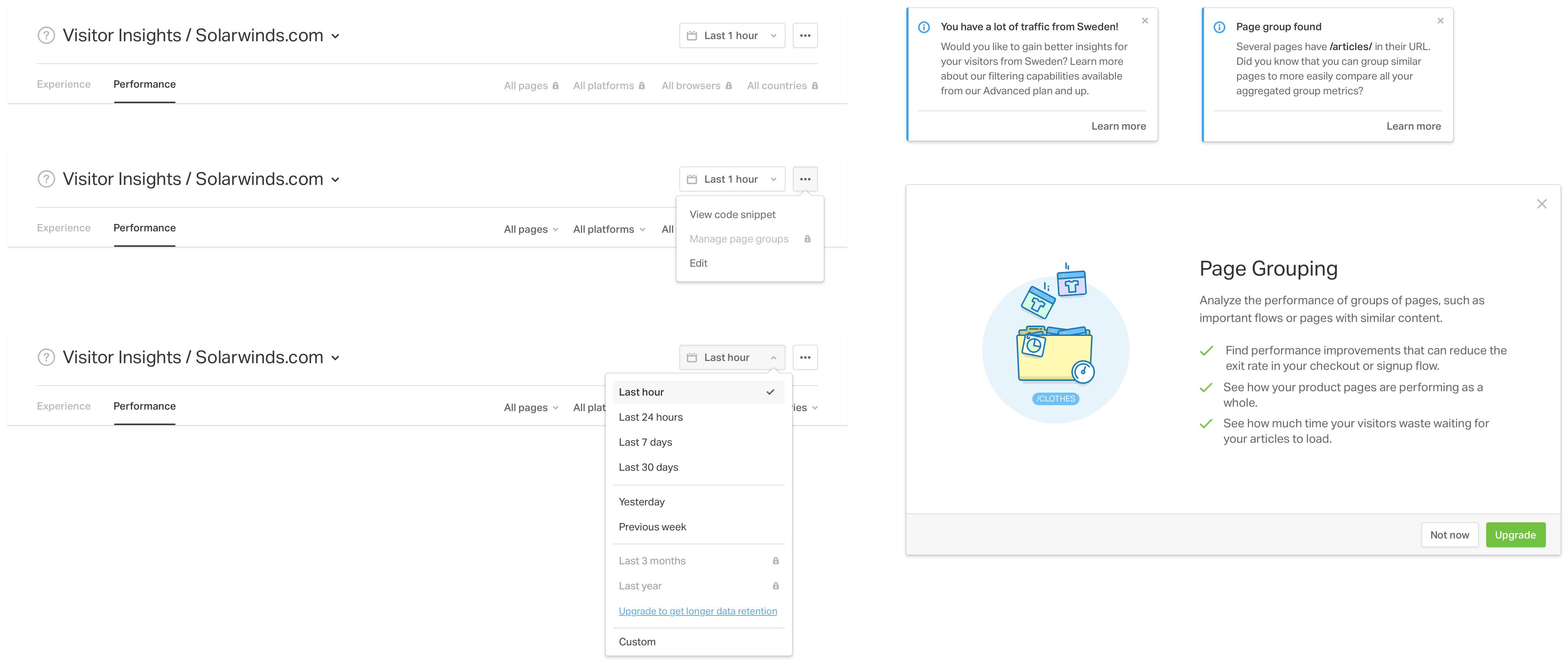
Pingdom is part of an ecosystem of four more or less integrated products. Initially these were four standalone applications with no real connection between them. People who wanted to use more than one of these products had to create multiple accounts and log in to each product individually. Together with four different product teams, we created a solution that allows people to sign up to a single account and log in once and instantly get access to all four products. Along with this came a new header and navigation that frames the content views and helps create a feeling of an integrated product experience.
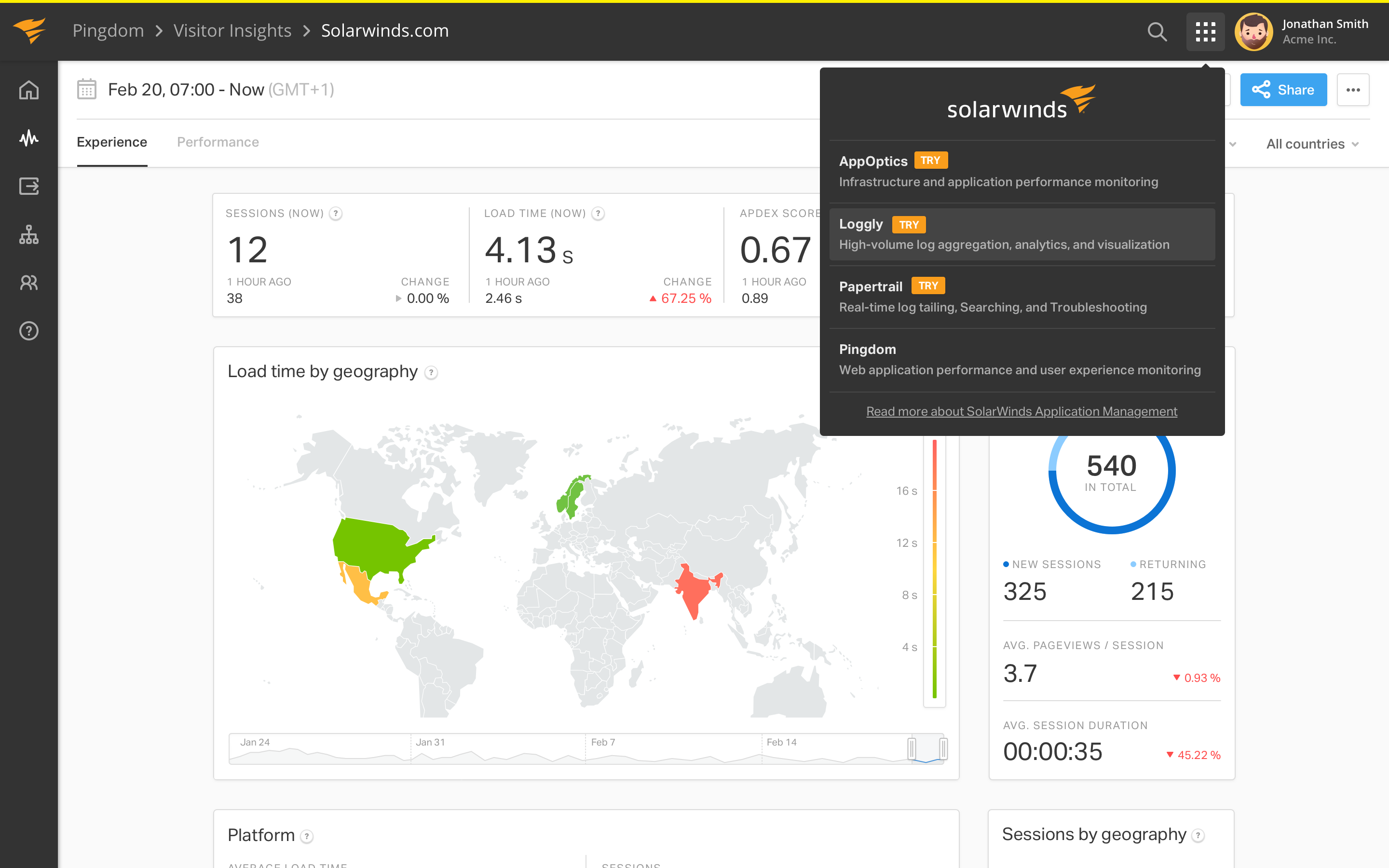
We made it easy to navigate between the different products via an "app-switcher" and to start a trial for products not yet used. People without access or permission to activate new products can send a request to the administrator.

If you would like to know more or just want to chat, email me at tony@neuromodule.com.